
SUBJECT TO CHANGE WINE CO
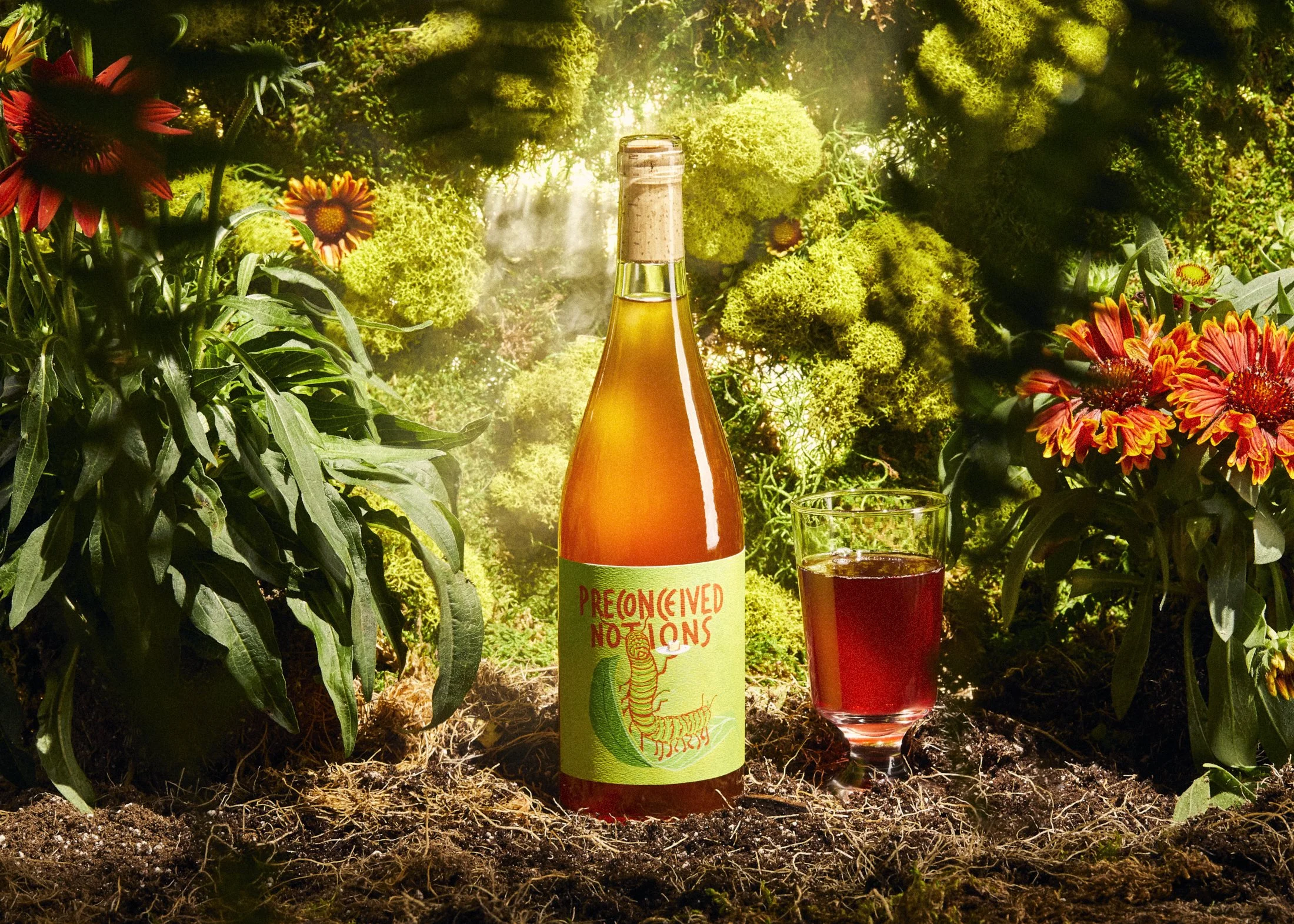
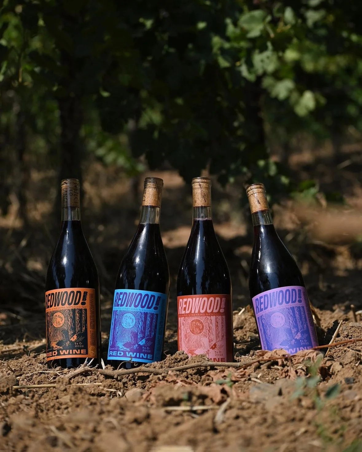
When the owners of Subject to Change Wine Co. approached me to design new labels for their burgeoning line of natural wines, I listened. Almost immediately, I intuited an opportunity for a full rebrand, driven by the conviction that natural wine in California was ready for its glow-up.
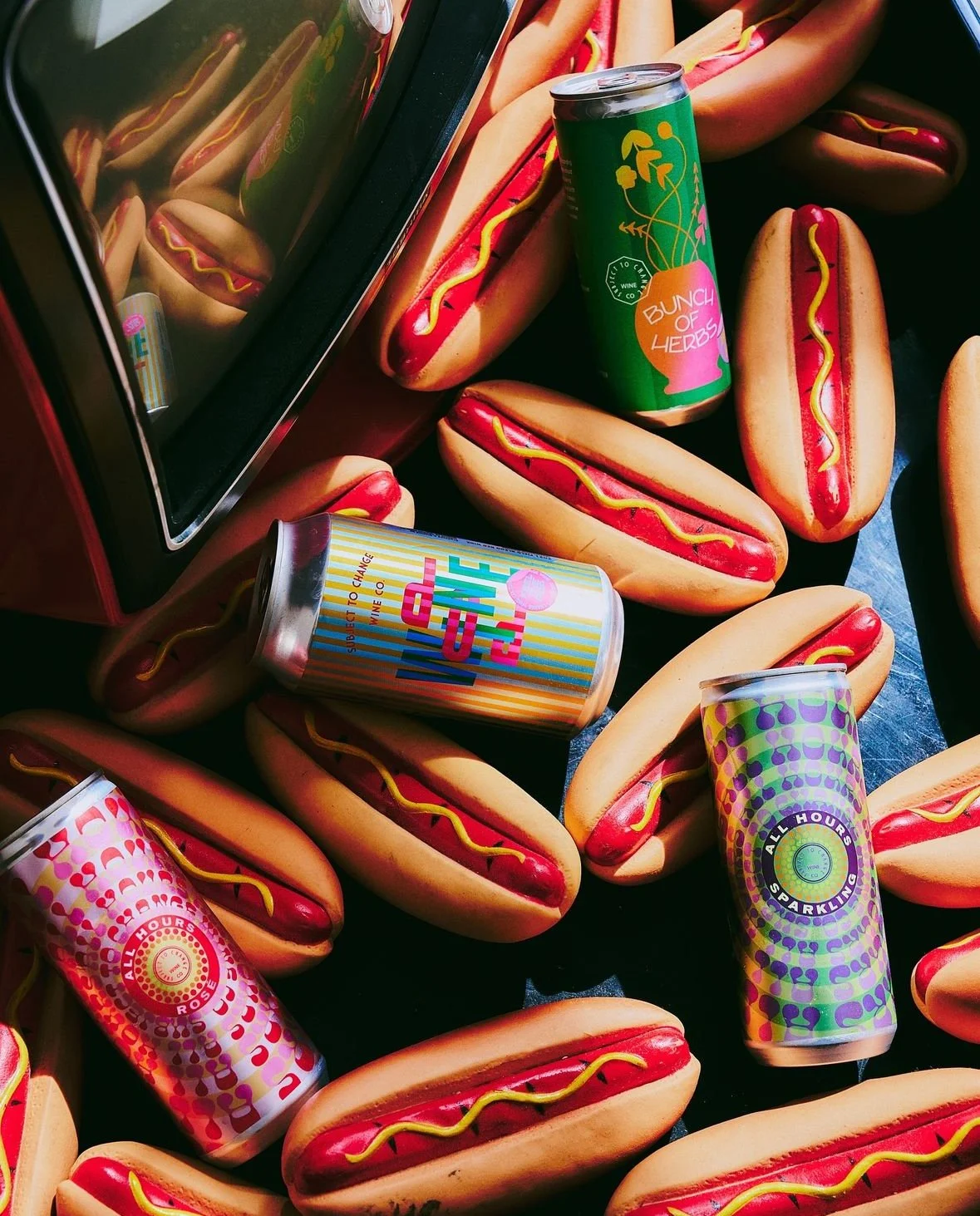
We set out to create a brand strategy that would vividly narrate the story of their grapes and offer a bold counterpoint to European wine labels. Our goal was to honor the naturalized varietals flourishing in California, weaving our love for the land with the rich legacy of California’s tradition of graphic design and visual art.
We weren’t focused on fleeting trends or timelessness. Instead, we embraced the creative process to reveal the rich stories behind California’s natural wines. For the label design, I drew inspiration from Victor Moscosso, a founding artist of Fillmore-era psychedelic posters, whom I’d met years earlier. Moscosso’s use of bold, vibrating colors left a lasting impression on me and his approach became a key influence in shaping the artwork.
The rebrand emerged as a personal love letter, a reflection of the wild, intrepid spirits embodied in each bottle and an expression of my creative voice. We captured the essence of California’s winemaking spirit—bold, authentic, and beautifully alive.
LOCATION
San Francisco, Ca
COMPLETION DATE
2023
INTENTION
Label design and rebranding of San Francisco Bay Area producer of natural wines.


Photography: Rob Williamson, Arthur Alvarez, & Lady Luck Studio
Styling: Audrey Taylor & Natalia Kaminski
Title Video: Erren Franklin


